x
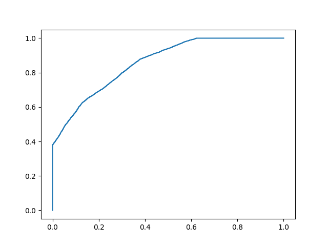
#Three lines to make our compiler able to draw:import sysimport matplotlibmatplotlib.use('Agg')import numpy as npimport matplotlib.pyplot as pltfrom sklearn.metrics import accuracy_score, confusion_matrix, roc_auc_score, roc_curven = 10000y = np.array([0] * n + [1] * n)# y_prob_1 = np.array( np.random.uniform(.25, .5, n//2).tolist() + np.random.uniform(.3, .7, n).tolist() + np.random.uniform(.5, .75, n//2).tolist())y_prob_2 = np.array( np.random.uniform(0, .4, n//2).tolist() + np.random.uniform(.3, .7, n).tolist() + np.random.uniform(.6, 1, n//2).tolist())def plot_roc_curve(true_y, y_prob): """ plots the roc curve based of the probabilities """ fpr, tpr, thresholds = roc_curve(true_y, y_prob) plt.plot(fpr, tpr) plt.xlabel('False Positive Rate') plt.ylabel('True Positive Rate')fpr, tpr, thresholds = roc_curve(y, y_prob_2)plt.plot(fpr, tpr)#Two lines to make our compiler able to draw:plt.savefig(sys.stdout.buffer)sys.stdout.flush()