Menu
×
   ❮   
HTML CSS JAVASCRIPT SQL PYTHON JAVA PHP HOW TO W3.CSS C C++ C# BOOTSTRAP REACT MYSQL JQUERY EXCEL XML DJANGO NUMPY PANDAS NODEJS R TYPESCRIPT ANGULAR GIT POSTGRESQL MONGODB ASP AI GO KOTLIN SASS VUE DSA GEN AI SCIPY AWS CYBERSECURITY DATA SCIENCE
     ❯   

Excel Tutorial

Excel HOME Excel Introduction Excel Get Started Excel Overview Excel Syntax Excel Ranges Excel Fill Excel Move Cells Excel Add Cells Excel Delete Cells Excel Undo Redo Excel Formulas Excel Relative Reference Excel Absolute Reference Excel Arithmetic Operators Excel Parentheses Excel Functions

Excel Formatting

Excel Formatting Excel Format Painter Excel Format Colors Excel Format Fonts Excel Format Borders Excel Format Numbers Excel Format Grids Excel Format Settings

Excel Data Analysis

Excel Sort Excel Filter Excel Tables Excel Conditional Format Excel Highlight Cell Rules Excel Top Bottom Rules Excel Data Bars Excel Color Scales Excel Icon Sets Excel Manage Rules (CF) Excel Charts

Table Pivot

Table Pivot Intro

Excel Case

Case: Poke Mart Case: Poke Mart, Styling

Excel Functions

AND AVERAGE AVERAGEIF AVERAGEIFS CONCAT COUNT COUNTA COUNTBLANK COUNTIF COUNTIFS IF IFS LEFT LOWER MAX MEDIAN MIN MODE NPV OR RAND RIGHT STDEV.P STDEV.S SUM SUMIF SUMIFS TRIM VLOOKUP XOR

Excel How To

Convert Time to Seconds Difference Between Times NPV (Net Present Value) Remove Duplicates

Excel Examples

Excel Exercises Excel Syllabus Excel Study Plan Excel Certificate

Excel References

Excel Keyboard Shortcuts


Excel Charts


Excel Charts

Charts are visual representations of data used to make it more understandable.

Commonly used charts are:

  • Pie chart
  • Column chart
  • Line chart

Different charts are used for different types of data.

Note: Charts are also called graphs and visualizations.

The chart above is a column chart representing the number of Pokemons in each generation.

Note: In some cases the data has to be processed before plotted into a chart.

Charts can easily be created in a few steps in Excel.


Creating a Chart in Excel

Creating a chart, step by step:

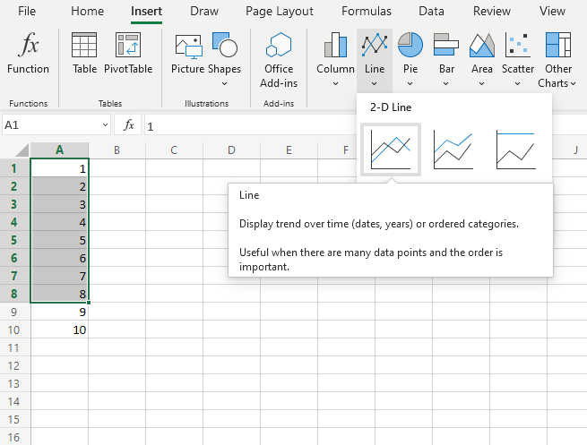
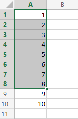
  1. Select the range A1:A8

Copy Values
  1. Click on the Insert menu, then click on the Line menu () and choose Line () from the drop-down menu

Note: This menu is accessed by expanding the ribbon.
You should now get this chart:

Excellent! You have now created your first chart.

Note: The cells 9 and 10 were not selected in the range, and therefore not included in the graph.


Creating Another Chart in Excel

Lets compare the stats for the Pokemons; Charmander, Squirtle and Bulbasaur using a column chart.

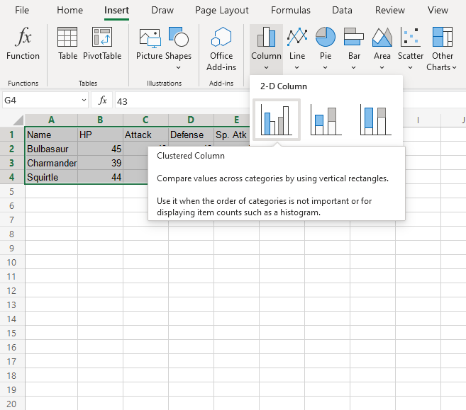
  1. Select the range A1:G4
Copy Values
  1. Click on the insert menu, then click on the column menu () and choose Clustered Column () from the drop-down menu

Note: This menu is accessed by expanding the ribbon.
You should now get this chart:
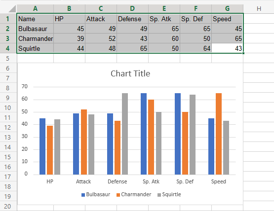
The chart gives a visual overview for the Pokemons stats.

Charmander, represented by the orange bars, and has the highest speed. Squirtle, represented by the gray bars, has the highest defense.

Note: The default chart title is "Chart Title". It can be changed. You will learn about chart customization in a later chapter.


×

Contact Sales

If you want to use W3Schools services as an educational institution, team or enterprise, send us an e-mail:
sales@w3schools.com

Report Error

If you want to report an error, or if you want to make a suggestion, send us an e-mail:
help@w3schools.com

W3Schools is optimized for learning and training. Examples might be simplified to improve reading and learning. Tutorials, references, and examples are constantly reviewed to avoid errors, but we cannot warrant full correctness of all content. While using W3Schools, you agree to have read and accepted our terms of use, cookie and privacy policy.

Copyright 1999-2024 by Refsnes Data. All Rights Reserved. W3Schools is Powered by W3.CSS.